Two design philosophies are shaping modern UI in 2026, one built on realistic textures, the other on soft extruded depth. Here is what each means, how they differ, and how to choose the right one.
SUMMARY
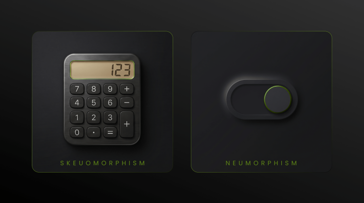
Skeuomorphism replicates real-world textures – leather, wood, glass – to make digital interfaces feel instantly familiar. It dominated early smartphone design and still holds value in specific contexts today.
Neumorphism is a newer, minimalist evolution that creates soft 3D depth by making elements appear to push out of – or sink into – a flat monochromatic background. It is modern and tactile, but needs careful attention to accessibility.
Both styles have a clear role in 2026. Neither is dead, and neither is universal. Context decides which one works.
Contents
- 1 What is Skeuomorphism?
- 2 What is Neumorphism (Neomorphism)?
- 3 Key Differences Between Skeuomorphism and Neumorphism
- 4 Neumorphism UI Design Trends in 2026
- 5 Glassmorphism and Hybrid Styles in 2026
- 6 When to Use Skeuomorphism vs Neumorphism
- 7 Accessibility Challenges and How to Fix Them
- 8 Frequently Asked Questions
- 8.1 What is the difference between skeuomorphism and neumorphism?
- 8.2 What is neomorphism in UI design?
- 8.3 Is skeuomorphism still used in 2026?
- 8.4 What are the neumorphism design trends for 2026?
- 8.5 What is the difference between neumorphism and glassmorphism?
- 8.6 Is neumorphism good for accessibility?
- 8.7 What replaced skeuomorphism?
What is Skeuomorphism?
Skeuomorphism is a design approach that makes digital interfaces look like real physical objects. A notes app styled like a yellow legal pad, a voice recorder that mimics a cassette machine, a calendar with leather stitching, these are all skeuomorphic designs.
The core idea is familiarity. When an interface looks like something the user already knows, they understand it immediately, no learning curve needed. This made skeuomorphism the dominant visual language of early smartphones throughout the 2000s.
Apple’s pre-iOS 7 design is the most recognised example, bookshelves with wooden textures, green felt game tables, reel-to-reel podcast players. Every interface borrowed from the physical world to make digital feel approachable.
- Look: Detailed, realistic, textures like leather, wood, glass, metal
- Depth: Created through drop shadows, highlights, and layered gradients
- Best for: Audio tools, gaming UIs, onboarding flows, non-tech-savvy users
- Pros: Intuitive, instantly familiar, high usability for new users
- Cons: Can look dated, heavy graphics slow loading, risks feeling cluttered
In 2026, skeuomorphism is no longer the default, but it is far from gone. It is used purposefully where physical realism genuinely adds value to the experience.
What is Neumorphism (Neomorphism)?
Neumorphism, a blend of “new” and “skeuomorphism,” is a UI design style that emerged around 2019. It doesn’t try to copy real-world objects but instead creates a soft, modern sense of depth using light and shadow on a single-color background.
In this style, elements look like they are slightly raised or pressed into the surface. The background and the element share the same base color, and only subtle shadows define their shape. This gives a clean, minimal, and tactile appearance.
The terms neumorphism and neomorphism are interchangeable and refer to the same design style.
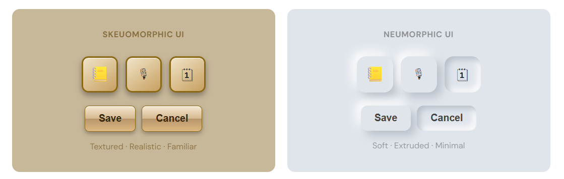
- Look: Minimal, soft, monochromatic, elements appear to grow out of the surface
- Depth: Two soft shadows, one light, one dark, on a neutral base colour
- Best for: Dashboards, cards, toggles, sliders, media players
- Pros: Premium aesthetic, lightweight (pure CSS), tactile feel
- Cons: Low contrast can fail accessibility standards; hard to distinguish interactive elements
Accessibility note: Early neumorphic designs frequently failed WCAG 2.2 contrast requirements. In 2026, modern neumorphism addresses this with stronger contrast and more selective application.
Key Differences Between Skeuomorphism and Neumorphism
Both styles use depth and shadow to create a tactile feel, but they do it in completely different ways, for different reasons, and for different audiences.
The clearest way to think about it: skeuomorphism borrows from the physical world to build familiarity. Neumorphism creates its own quiet visual language, tactile but entirely digital.
| Skeuomorphism | Neumorphism |
|---|---|
| Mimics real objects and materials | Creates depth from within the surface |
| Instantly recognisable to any user | Modern, premium, and elegant look |
| High visual contrast with a strong accessibility baseline | Lightweight with no heavy assets required |
| Can feel heavy or outdated in modern interfaces | Requires careful handling of contrast for accessibility |
| Best suited for games and legacy-style designs | Best suited for dashboards and productivity tools |
Neumorphism UI Design Trends in 2026
The neumorphism of 2020 and the neumorphism of 2026 are not the same thing. The style has matured significantly, weaknesses addressed, use cases sharpened. Designers now call it “New Neumorphism,” often combining it with modern UX strategies, including AI-driven approaches that are now playing a key role in improving user engagement and website conversions.
Claymorphic hybrid
Moving away from stark dual-shadow effects, 2026 favors a softer, clay-like feel. Elements appear molded from the background, rounded, puffy, and warm rather than cold and geometric. This variant is called Claymorphism, and it has become one of the defining visual trends of the year.
Selective, component-level use
Full-screen neumorphism is rare in 2026. Designers apply it to specific elements, toggles, sliders, cards, input fields, while keeping the rest of the UI flat and clean. This avoids the monotony and contrast problems of earlier approaches.
Tactile micro-interactions
Buttons now sink on press. Sliders feel weighted. Toggles snap satisfyingly. Motion reinforces the tactile metaphor, making the interaction behaviour match what the visual style promises.
Accessibility-first contrast
Modern neumorphism pairs soft shadow aesthetics with stronger text contrast ratios to meet WCAG 2.2 standards. The visual style no longer has to sacrifice usability for aesthetics, they coexist.
Hybrid integration
Neumorphism rarely stands alone now. It is combined with flat design, glassmorphism, and 3D elements for layered, multi-dimensional interfaces. Finance apps, wellness dashboards, and productivity tools are the leading adopters of this approach.
Where it is thriving in 2026: Banking apps, health trackers, productivity dashboards, smart home controls, and premium portfolio sites are the most active users of refined neumorphism.
Glassmorphism and Hybrid Styles in 2026
A third visual style has grown significantly alongside these two: Glassmorphism. Where neumorphism creates depth by pushing elements out of a neutral surface, glassmorphism floats panels above a colourful blurred background, like frosted glass.
It uses background blur, high transparency, and subtle borders to achieve its effect. Apple’s macOS and iOS have adopted it extensively across their system UIs, and it has since moved into app design broadly.
- Neumorphism vs. Glassmorphism: Neumorphism uses an opaque surface with dual shadows. Glassmorphism uses transparency and background blur.
- Together in 2026: Many interfaces layer both, a glassmorphic panel sitting above a neumorphic surface creates rich multi-dimensional depth.
- Skeuomorphism + Neumorphism: Skeuomorphic icons paired with neumorphic interactive controls is a common and effective 2026 pattern.
The current infographic visual styles, isometric, flat, neomorphism, and sketch, all coexist in 2026. The best designers treat them as tools, not identities, picking the right one for each context.
When to Use Skeuomorphism vs Neumorphism
There is no universal winner. The right style depends on your audience, your product’s purpose, and the emotional tone you need to establish.
Choose Skeuomorphism when:
- Your app replicates a physical tool, an instrument, recorder, or notebook
- Your users are older, less tech-savvy, or first-time smartphone users
- You are building a game or entertainment app where realism adds immersion
- Onboarding flows need to feel instantly familiar to a wide audience
- Your brand voice is warm, craft-focused, or heritage-inspired
Choose Neumorphism when:
- Your UI is focused, a dashboard, settings page, or media player
- You want a premium, modern look without heavy visual complexity
- You are applying it selectively, cards, toggles, sliders, not full screens
- Your users are design-aware and your brand positions as sophisticated
- You are building for finance, wellness, or productivity verticals
Pro tip for 2026:The most effective UIs rarely use one style in isolation. Layer neumorphic components onto a flat layout, combine glassmorphic panels with skeuomorphic illustrations. Let context decide, not trends.
Accessibility Challenges and How to Fix Them
Accessibility is where both styles have clashed with real-world usability, and where the most meaningful progress has happened heading into 2026.
Skeuomorphism and accessibility
Skeuomorphism generally has a strong contrast because its textures and shadows create clear visual separation. The bigger concern is cognitive load, richly detailed interfaces can overwhelm users with visual processing difficulties. Heavy assets also slow loading on low-bandwidth connections.
Neumorphism and accessibility
This is where the style has historically struggled. Early neumorphic designs used soft shadows on same-colour backgrounds, producing low contrast that frequently failed WCAG 2.2 requirements. With an estimated 300 million+ people worldwide living with visual impairments, this is not a minor issue.
In 2026, the fix is clear: use stronger text contrast ratios, make interactive elements clearly distinguishable from static surfaces, and never sacrifice readability for aesthetics. The WCAG 2.2 minimum for normal text is 4.5:1, test everything before shipping.
Before you ship:Run every neumorphic button, label, and input through a contrast checker. If it cannot reach 4.5:1, adjust the shadows, add a visible border, or reconsider the approach for that element.
Frequently Asked Questions
What is the difference between skeuomorphism and neumorphism?
Skeuomorphism replicates real-world physical materials such as leather, glass, and wood to create familiar digital interfaces. Neumorphism, on the other hand, creates soft 3D depth by making elements appear to emerge from or press into a monochromatic background using dual shadows. While skeuomorphism focuses on realism and recognition, neumorphism emphasizes tactile minimalism and modern elegance.
What is neomorphism in UI design?
Neomorphism (also spelled neumorphism) is a UI design style that creates subtle, soft 3D effects using two shadows, one light and one dark, on a flat, single-colour background. Elements appear slightly raised or pressed into the surface, giving a minimalist, tactile, and modern feel. It is commonly used for UI components like buttons, cards, and sliders.
Is skeuomorphism still used in 2026?
Yes, but selectively. While it is no longer a dominant design style, skeuomorphism remains effective in areas like audio and music production software, gaming interfaces, onboarding flows for non-technical users, and applications where physical realism adds value. For example, Apple’s Voice Memos and Notes apps still include skeuomorphic elements to enhance usability.
What are the neumorphism design trends for 2026?
Neumorphism in 2026 has evolved into “New Neumorphism.” This includes claymorphic hybrid textures, selective component-level usage, tactile micro-interactions, improved accessibility with better contrast, and integration with flat design and glassmorphism. It is widely used in finance apps, health dashboards, and productivity tools.
What is the difference between neumorphism and glassmorphism?
Neumorphism creates depth using dual shadows on an opaque, neutral background, making elements appear embedded or raised from the surface. Glassmorphism, in contrast, uses transparency and background blur to create a frosted glass effect, where elements appear layered above colourful backgrounds. In modern UI design, both styles are often combined for a more dynamic interface.
Is neumorphism good for accessibility?
Early neumorphism designs had accessibility issues due to low contrast, often failing WCAG standards. However, in 2026, the approach has improved significantly. Designers now combine soft shadow effects with strong text contrast, clear interactive cues, and proper colour separation, making accessibility a core part of neumorphic design.
What replaced skeuomorphism?
Flat design replaced skeuomorphism with the introduction of Apple’s iOS 7 in 2013. Google later introduced Material Design in 2014, bringing back subtle shadows for better hierarchy, often referred to as “flat design 2.0.” Neumorphism emerged in 2019 as a modern evolution, reintroducing depth without heavy realism.
Netstager is a leading digital marketing agency in Dubai and one of the most trusted web design and digital marketing companies in India, offering SEO, Google Ads, social media marketing, web design, mobile apps, branding, and software development to help businesses build a powerful and results-driven online presence. Whether you’re looking for creative digital strategies, performance-focused marketing, or technology-driven web solutions, our teams deliver end-to-end services that help brands grow and connect effectively with their audience. For more details, visit our UAE and India websites for support.
Contact Our Development Team Today: At +91 844 844 0112 or reach out via email at [email protected].